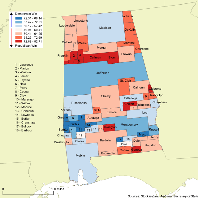
Cartogram of the 2017 Alabama Special Senatorial Race

The geographically accurate cartogram above resizes the counties based on the number of votes cast in the Senate race between Republican Roy Moore and Democrat Doug Jones. The more votes cast in a county, the larger it is on the map. This cartogram shows that Jones won the four largest counties (Jefferson, Madison, Mobile, and Montgomery) whereas Moore won the fifth and sixth largest counties. It proved not to be enough to get him past the post.
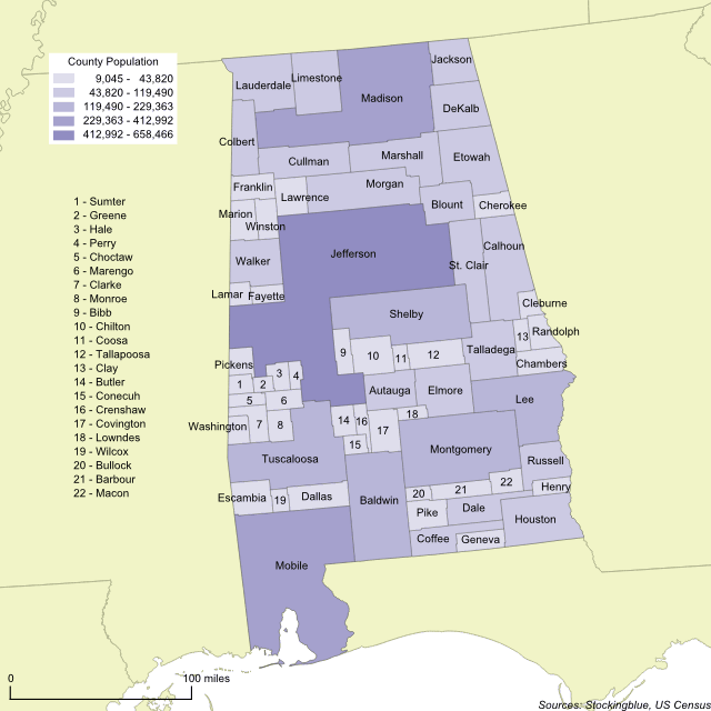
What to Look for in the 2017 Alabama Special Senatorial Race

The geographically accurate cartogram above represents the population of Alabama's counties. The more populous a county is, the larger it is on the map. This cartogram shows that Jefferson, Madison, and Mobile are the most populous counties by far and together the three counties account for just under 30 percent of the state's total population. This, in a state with 67 counties.
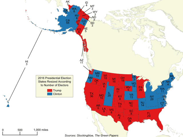
The 2016 Presidential Election Cartogram Based on Electors

The geographically accurate cartogram above represents the 2016 presidential election with states resized according to the number of electors they have. The more electors a state has, the larger it is on the map. Compared to traditional maps, this map shows the electoral vote in a more accurate way painting the entirety of the United States with the appropriate amount of each color.
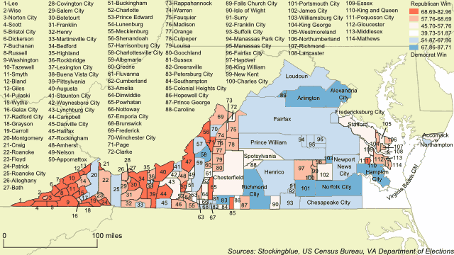
The 2017 Virginia Gubernatorial Race Based on County Population

The geographically accurate cartogram above represents the Virginia governor's race results based on the population of each county. The more populous a county is, the larger it is on the map. Looking at a map of Virginia with the results of this race, the entire state is painted red leading the casual observer to believe that the Republican candidate, Ed Gillespie, won the race. However, the map above shows that those small pockets of blue are very populous and what they lack in geography they more than make up for in votes and it gives a better picture as to how the Democratic candidate, Ralph Northam, won the race.
Newer