Pumpkin Production in the United States
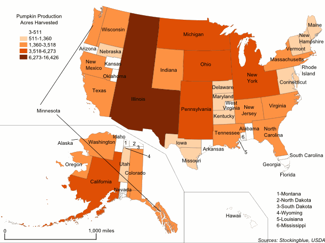
This week, the focus is on common Thanksgiving foods and which states produce them. The geographically accurate cartogram above redraws the states' sizes based on pumpkin production. Specifically the number of acres dedicated to the pumpkin harvest. Every state produces pumpkins, but some dedicate so few acres to the crop that they barely show up on the map, namely Alaska, Wyoming, and Louisiana.
Cranberry Production in the United States
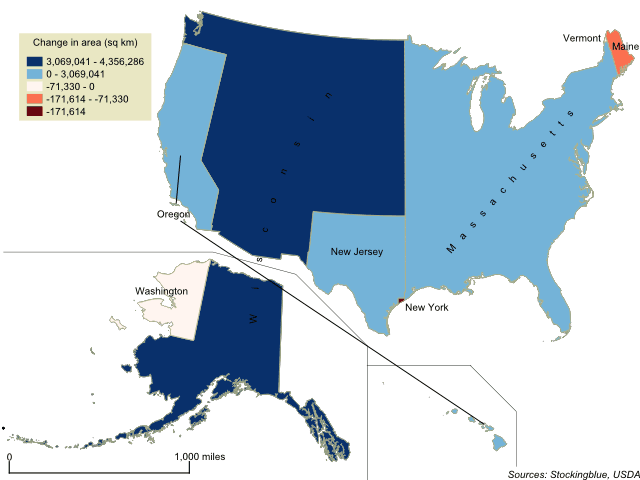
Where does Thanksgiving dinner come from? This week, the focus is on some staple Thanksgiving foods and which states produce them. The geographically accurate cartogram above redraws the states' sizes based on cranberry production. There are only a few states that produce the fruit according to the United States Agriculture Census.
The United States' Borders Based on Per Capita GDP
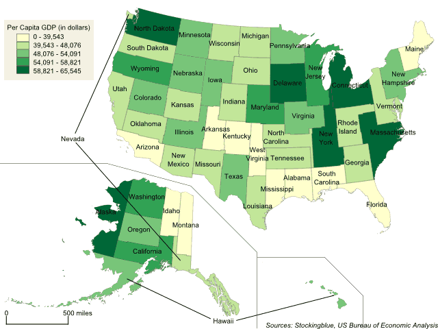
The geographically accurate cartogram above represents the states' boundaries based on per capita GDP. In this metric, all 50 states have similar areas as there is not much fluctuation from state to state.
The United States' Borders Based on Gross Domestic Product
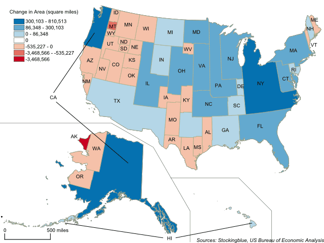
The geographically accurate cartogram above represents the states' boundaries based on gross domestic product. California, New York, and Texas take up large swaths of the country while Alaska nearly loses all of its territory.
The United States' Borders Based on Population
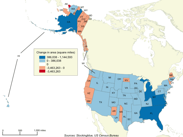
The geographically accurate cartogram above represents the borders of the states in the US based on their population. California becomes the largest state by far while Massachusetts, New York and Florida dominate the east coast. Texas takes over the Southwest while Alaska loses the most territory.
The Arabian Peninsula's Borders Based on Per Capita GDP
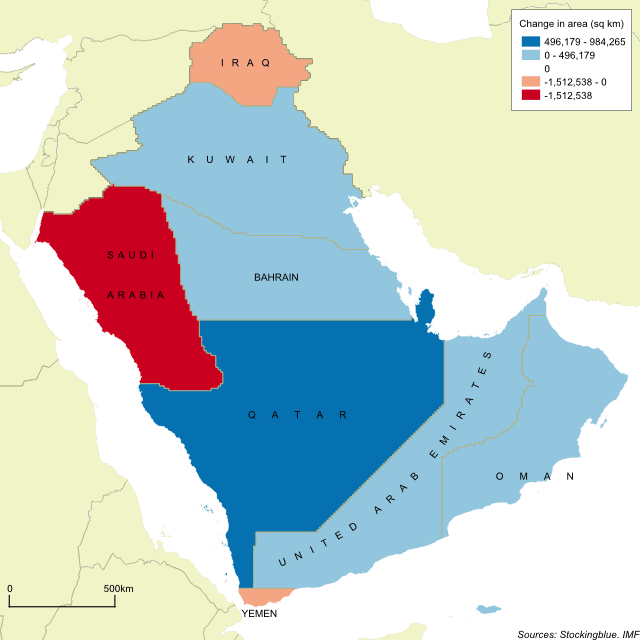
The geographically accurate cartogram above represents the borders of the nations in the region based on their per capita GDP. Qatar becomes the largest state in the region by far and is nearly double the size of the second largest state.
The Arabian Peninsula's Borders Based on Population
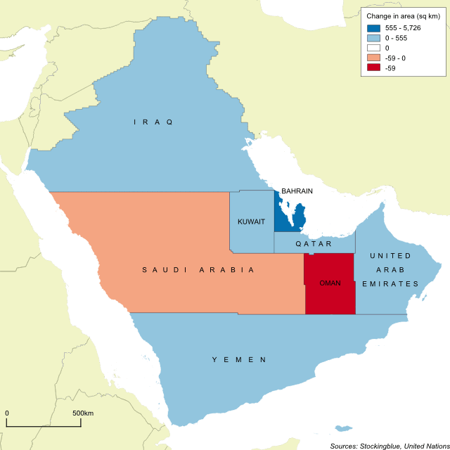
The geographically accurate cartogram above represents the borders of the nations in the region based on their population. Iraq becomes the largest country with Saudi Arabia a close second.
The Arabian Peninsula's Borders Based on Military Personnel
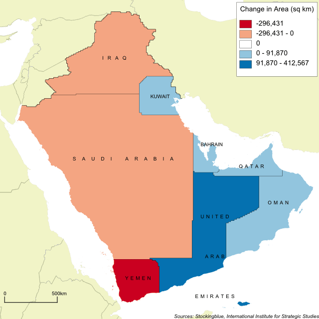
The geographically accurate cartogram above represents the borders of the nations in the region based on the number of active military personnel. Once again, the kingdom of Saudi Arabia dominates its neighbors.
The Arabian Peninsula's Borders Based on Oil Production
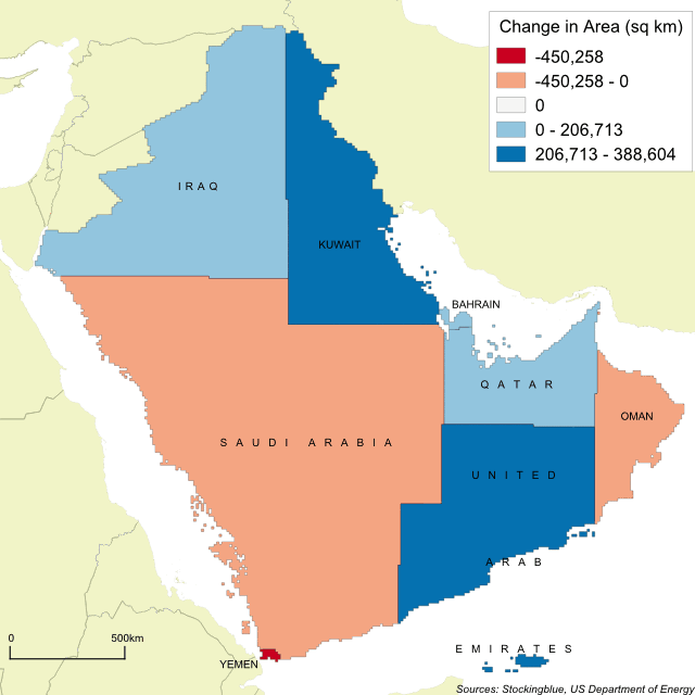
The geographically accurate cartogram above represents the borders of the nations in the region based on oil production. Surprisingly, Saudi Arabia shrinks in size, however, it still remains the largest state in the region.
The Arabian Peninsula's Borders Based on Gross Domestic Product
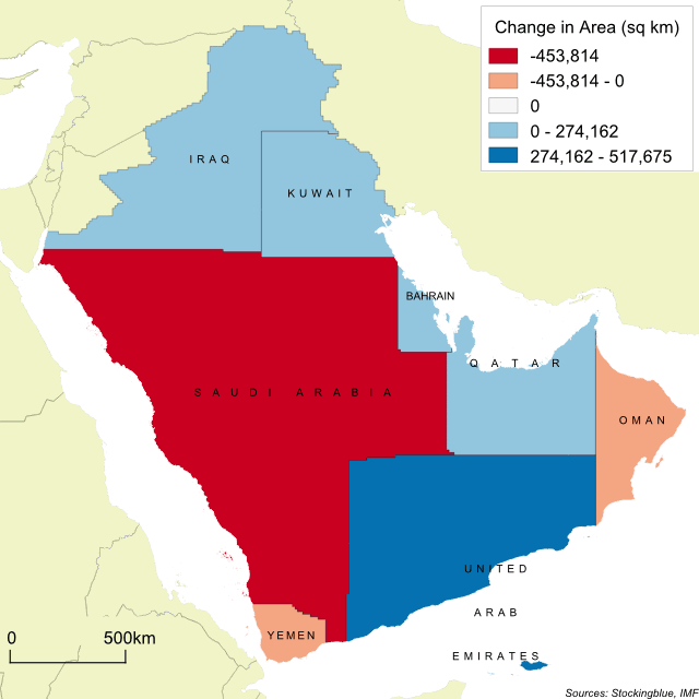
This week, the focus is on the Arabian Peninsula as recent events there are causing global concern. The geographically accurate cartogram above represents the nations in the region based on gross domestic product.
OlderNewer