Per Capita Gross Domestic Product Cartogram of the Constituent States of the United Kingdom
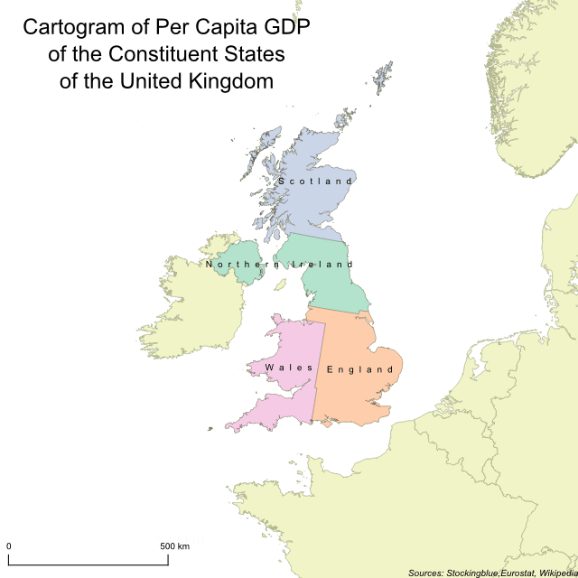
In this geographically accurate cartogram, the constituent states of the United Kingdom are redrawn according to their per capita gross domestic product (GDP). All four states of the United Kingdom are pretty equally sized which shows that the distribution of wealth between the constituent states is pretty even.
Gross Domestic Product Cartogram of the Constituent States of the United Kingdom
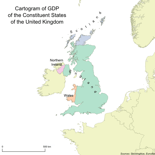
In this geographically accurate cartogram, the constituent states of the United Kingdom are redrawn according to their gross domestic product (GDP). England is the only state to gain territory at the expense of the other three and it gains more territory than it did when borders were redrawn for population.
Population Cartogram of Constituent States of the United Kingdom
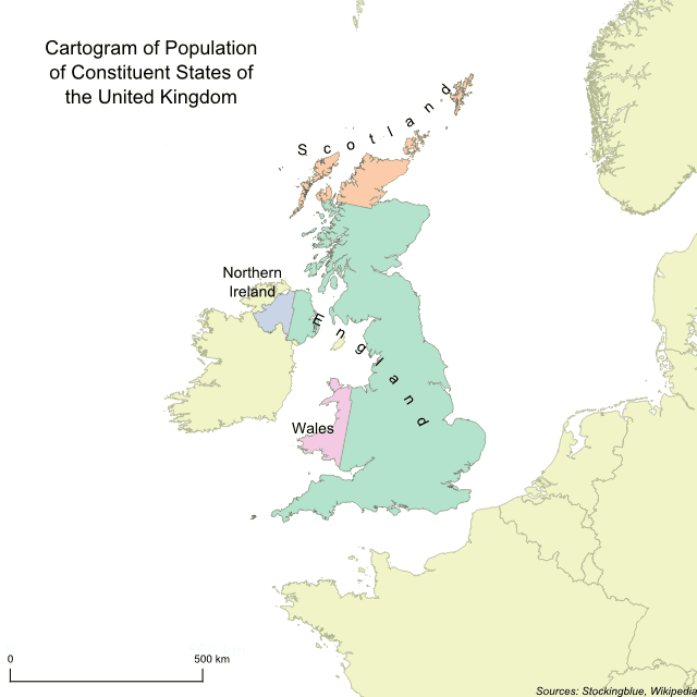
In this geographically accurate cartogram, the constituent states of the United Kingdom are redrawn according to their population. England is the only state to gain territory at the expense of the other three.
Grape Production in the United States
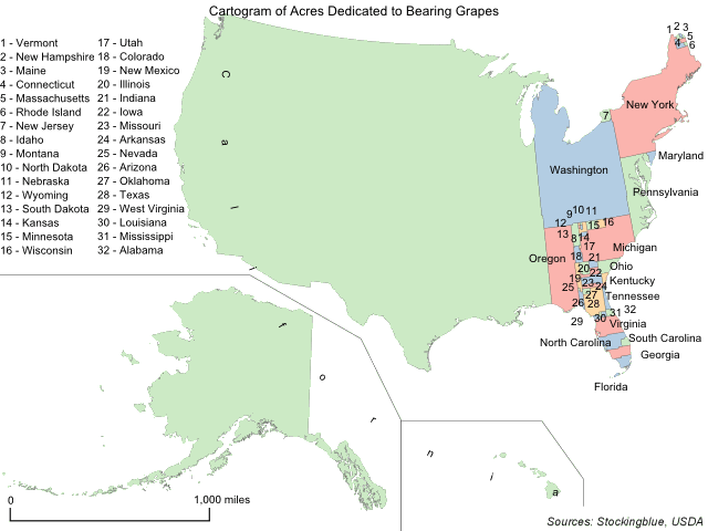
This week, like last year, the focus is on common Thanksgiving foods and which states produce them. The geographically accurate cartogram above redraws the states' sizes based on grape production. Specifically the number of acres dedicated to bearing the fruit. All states except for one, Alaska, produce grapes and of the 49, the USDA publishes complete data on only 47 of them due to the other two states having few producers which would make it easy for their competitors to know how large their operations are.
Apple Production in the United States
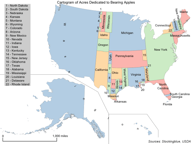
This week, like last year, the focus is on common Thanksgiving foods and which states produce them. The geographically accurate cartogram above redraws the states' sizes based on apple production. Specifically the number of acres dedicated to bearing the fruit. All 50 states produce apples and of the 50, the USDA publishes complete data on only 48 of them due to the other two states having few producers which would make it easy for their competitors to know how large their operations are.
Carrot Production in the United States
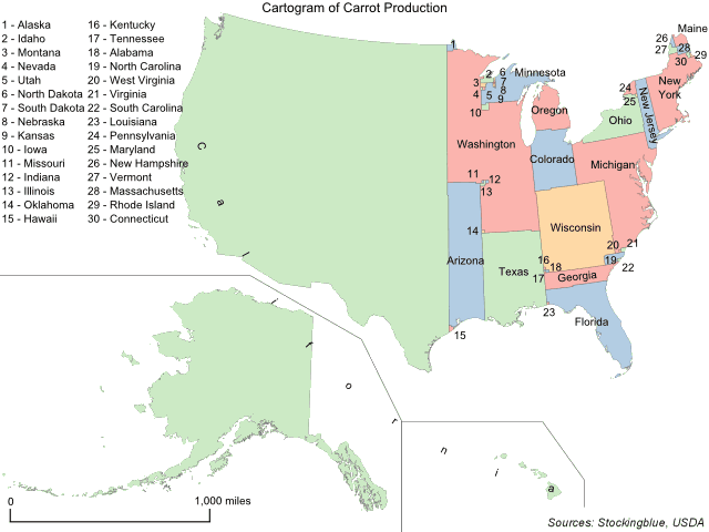
This week, like last year, the focus is on common Thanksgiving foods and which states produce them. The geographically accurate cartogram above redraws the states' sizes based on carrot production. Specifically the number of acres harvested. All 50 states produce the vegetable and of the 50, the USDA publishes complete data on only 45 of them due to the other five states either having few producers which would make it easy for their competitors to know how large their operations are or a very small number of acres harvested.
Brussels Sprout Production in the United States
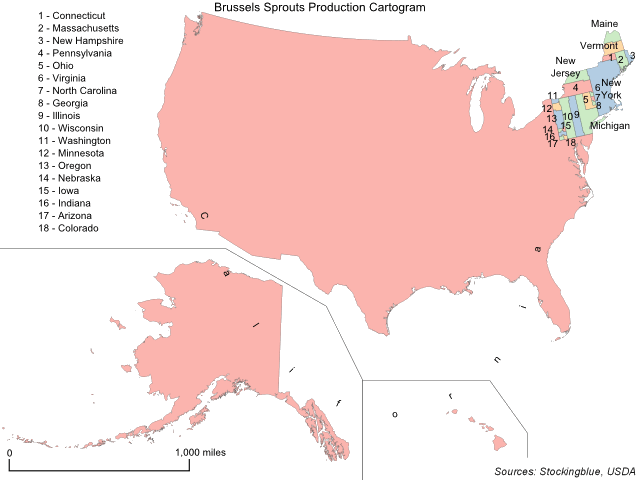
This week, like last year, the focus is on common Thanksgiving foods and which states produce them. The geographically accurate cartogram above redraws the states' sizes based on Brussels sprout production. Specifically the number of acres harvested. Only 32 states produce the vegetable and of the 32, the USDA publishes complete data on only 24 of them due to the other eight states either having few producers which would make it easy for their competitors to know how large their operations are or a very small number of acres harvested.
Pecan Production in the United States
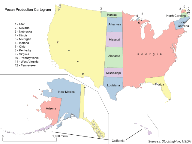
This week, like last year, the focus is on common Thanksgiving foods and which states produce them. The geographically accurate cartogram above redraws the states' sizes based on pecan production. Specifically the number of acres harvested. Only 34 states produce the nut and of the 34, the USDA publishes complete data on only 26 of them due to the other eight states having few producers which would make it easy for their competitors to know how large their operations are.
The 2018 New York Gubernatorial Results Based on County Population
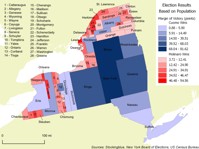
The geographically accurate cartogram above shows the 2018 gubernatorial results in New York based on county populations. The larger the county on this map, the larger its population. The map shows that even though Andrew Cuomo only won 15 of the 62 counties in the state, those 15 counties make up such a large chunk of the state's population that he could afford to lose 47 counties.
Cartogram of Population in Alaska
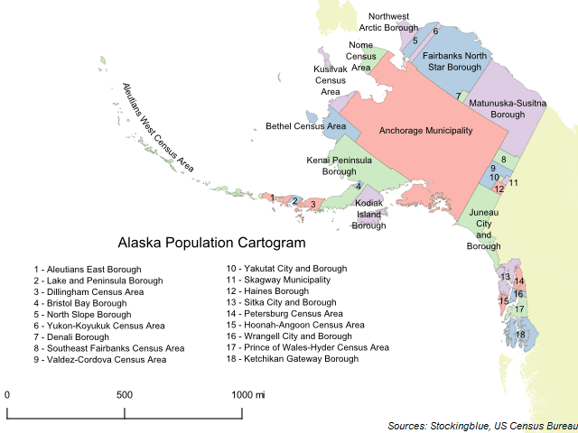
The geographically accurate cartogram above represents the size of the boroughs and census areas of Alaska based on their population. Anchorage makes up nearly half (41.09%) of the state's population and thus takes up a significantly larger portion of the state's landmass than it currently does.
Older