The United States' Borders Based on Per Capita GDP
Nov 17, 2017

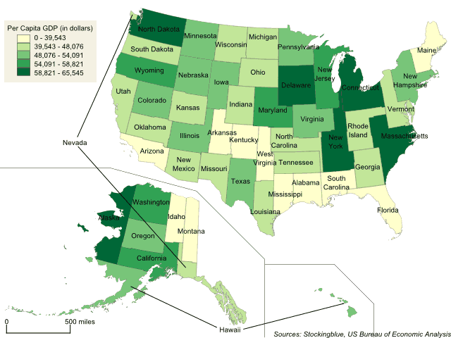
The geographically accurate cartogram above represents the states' boundaries based on per capita GDP. In this metric, all 50 states have similar areas as there is not much fluctuation from state to state.
The Arabian Peninsula's Borders Based on Per Capita GDP
Nov 10, 2017

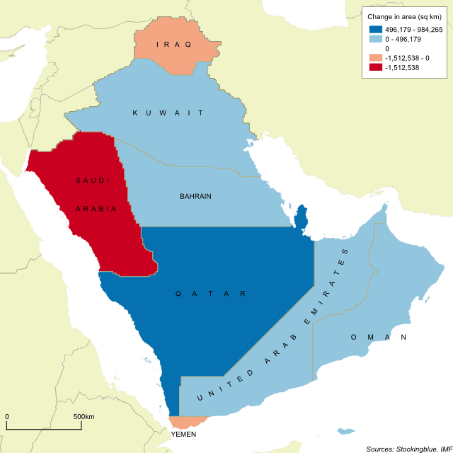
The geographically accurate cartogram above represents the borders of the nations in the region based on their per capita GDP. Qatar becomes the largest state in the region by far and is nearly double the size of the second largest state.
GDP and GDP Per Capita Growth between 2005 and 2016 in the European Union and the United States
Oct 27, 2017

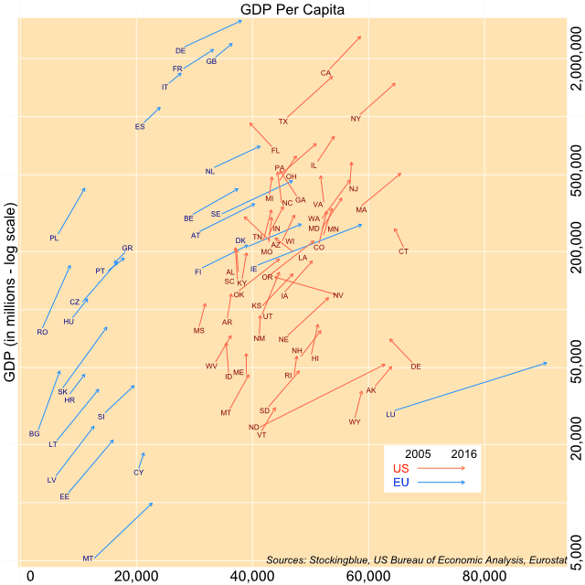
The chart above shows both the change in overall GDP (y-axis) and per capita GDP (x-axis) over a period of 11 years for EU and US states. All states except for one have experienced growth from 2005 to 2016. However, several states saw their per capita GDP decrease.
Newer