Cranberry Production in the United States
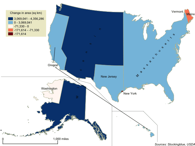
Where does Thanksgiving dinner come from? This week, the focus is on some staple Thanksgiving foods and which states produce them. The geographically accurate cartogram above redraws the states' sizes based on cranberry production. There are only a few states that produce the fruit according to the United States Agriculture Census.
The United States' Borders Based on Per Capita GDP
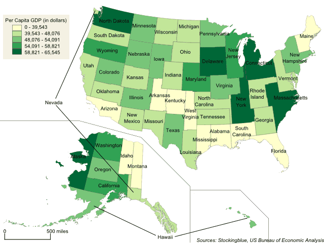
The geographically accurate cartogram above represents the states' boundaries based on per capita GDP. In this metric, all 50 states have similar areas as there is not much fluctuation from state to state.
The United States' Borders Based on Gross Domestic Product
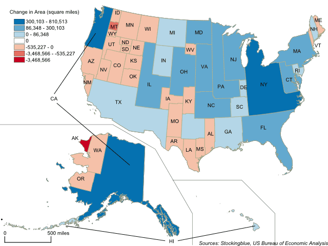
The geographically accurate cartogram above represents the states' boundaries based on gross domestic product. California, New York, and Texas take up large swaths of the country while Alaska nearly loses all of its territory.
The 2016 Presidential Election Cartogram Based on Electors
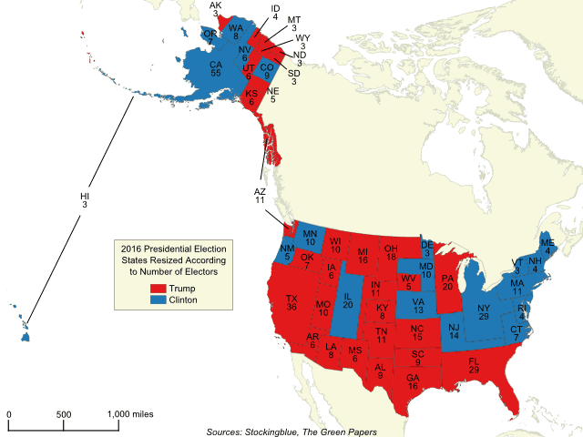
The geographically accurate cartogram above represents the 2016 presidential election with states resized according to the number of electors they have. The more electors a state has, the larger it is on the map. Compared to traditional maps, this map shows the electoral vote in a more accurate way painting the entirety of the United States with the appropriate amount of each color.
The United States' Borders Based on Population
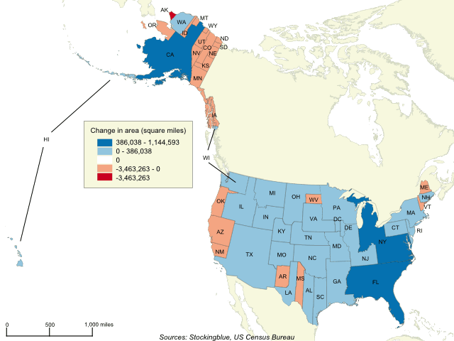
The geographically accurate cartogram above represents the borders of the states in the US based on their population. California becomes the largest state by far while Massachusetts, New York and Florida dominate the east coast. Texas takes over the Southwest while Alaska loses the most territory.
GDP and GDP Per Capita Growth between 2005 and 2016 in the European Union and the United States
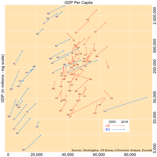
The chart above shows both the change in overall GDP (y-axis) and per capita GDP (x-axis) over a period of 11 years for EU and US states. All states except for one have experienced growth from 2005 to 2016. However, several states saw their per capita GDP decrease.
Fiber-Optic Penetration in Europe and the United States
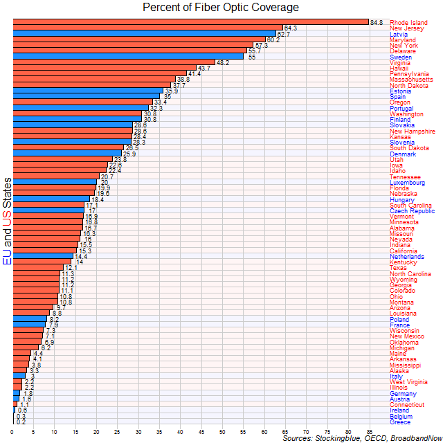
Most states in both the United States and the European Union are slow to pick up on fiber usage with only seven states from both superstates covering over half of their population. Ten of the top 12 states where fiber is most accessible are from the US.
A Comparison of Climates in European and American States
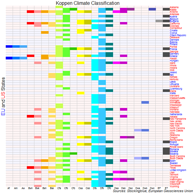
The European Union and the United States take up large swaths of geography but at the same time are broken down into states that allow for differences within the superstates to be examined further. Here, the climates that exist in these two entities are broken down by state. By far the most abundant climates in both entities are the continental and the temperate as classified by the most widely used climate classification system, the Köppen Climate Classification.
OlderNewer